Color Psychology in Branding and Packaging and Consumer Perception
Visual elements serve as the primary conduit through which consumers interpret product value, brand identity, and corporate positioning. Among these elements, color is registered by the human visual system in as little as 13 milliseconds, operating as the most immediate and profound sensory cue in consumer environments 1. The neurological processing of color activates the visual cortex more extensively than any other visual attribute, while simultaneously engaging the limbic system, which governs mood, memory, and emotional response 22. Consequently, research indicates that consumers typically make initial judgments about a product or brand within 90 seconds of exposure, with 62% to 90% of that assessment based solely on color 3545.
This immediate, subconscious processing mechanism means that color psychology is not merely an aesthetic consideration but a critical strategic asset. It influences cognitive processing, emotional response, and purchase intent across physical packaging and digital interfaces. The following analysis examines the multidimensional influence of color psychology on consumer perception, exploring foundational theoretical frameworks, the structural dimensions of color, the necessity of color-brand congruence, cross-cultural variances, and modern applications in sustainable packaging and digital commerce.
Theoretical Frameworks of Color Preference
Understanding how and why consumers react to specific colors requires an examination of the psychological, evolutionary, and contextual mechanisms that dictate human color preference. Two primary theories dominate the academic discourse on this subject: the Ecological Valence Theory and the Color-in-Context theory.
Ecological Valence Theory and Evolutionary Psychology
The Ecological Valence Theory (EVT), proposed by researchers Stephen E. Palmer and Karen B. Schloss in 2010, asserts that human color preferences are determined by an individual's combined affective response to environmental objects and situations historically associated with a specific color 267811. Rather than viewing color preference as an arbitrary aesthetic choice or a hardwired retinal contrast, EVT suggests that evolutionary survival mechanisms and individual associative learning form a continuous feedback loop.
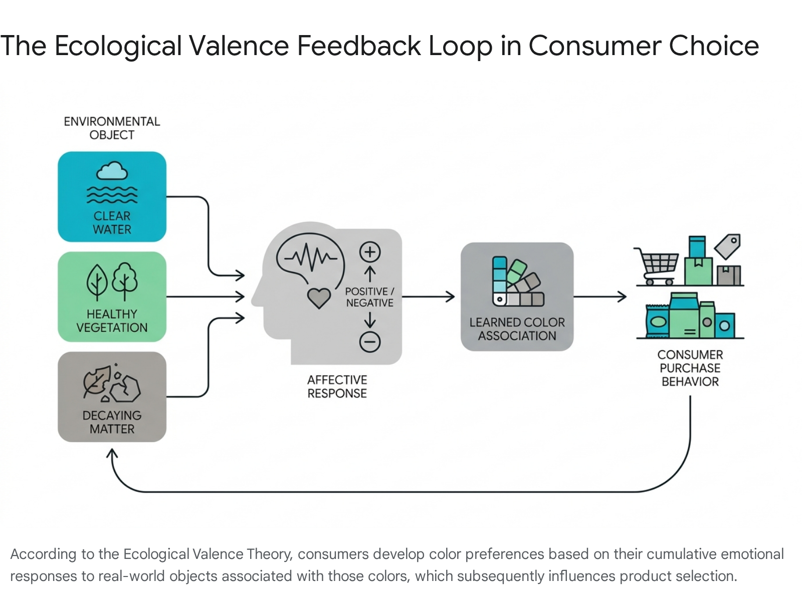
Humans demonstrate a systemic attraction to colors associated with objects that evoke positive biological or psychological reactions, and a repulsion to colors linked to negative outcomes 79.
For instance, the widespread global preference for blues and cyans is rooted in positive evolutionary associations with clear skies and clean water - elements essential for survival that naturally evoke calmness, safety, and relaxation 2611. Greens are generally associated with healthy vegetation and growth, which neurologically lowers cortisol levels and supports physical restoration 26. Evolutionary psychologists also postulate that specific gender-based color sensitivities developed during early human history; for example, the theory suggests that female brains developed a heightened sensitivity to reddish-pink hues to identify ripe berries and fruits against green foliage during foraging, embedding a survival-based preference for warm colors 11.
Conversely, dark yellow-greens (olive) and dark oranges (brown) are frequently associated with biological waste, decay, feces, or rotten food 79. The empirical foundation of EVT was demonstrated through the Berkeley Color Project, a large-scale repeated measures design study involving 48 participants testing 32 chromatic colors. The study confirmed that dark orange and dark yellow were significantly less preferred than other hues, and it established that the weighted affective valence estimate of color-associated objects reliably predicted human color preferences 79. When an inherently neutral or even disliked color is repeatedly paired with a highly desirable object through associative learning over an individual's lifetime, consumer preference for that color increases significantly, underscoring the dynamic nature of color perception 91011.
Color-in-Context Theory and Embodied Meaning
While the Ecological Valence Theory explains baseline human preferences, the Color-in-Context theory posits that colors do not possess universal, immutable meanings that apply across all situations 1112. Instead, the psychological impact and referential meaning of a color are highly dependent on the situational, environmental, and product context in which it is viewed 1112. For example, the color red can signal "excitement," "passion," or "speed" in the context of a sports car or dating application, but it functions as a strict warning of "danger," "loss," or "failure" in financial software or safety equipment contexts 1116.
Simultaneously, psychological researchers distinguish between this referential meaning (which is learned and context-dependent) and embodied meaning. Embodied meaning results from physiological responses to the aesthetic stimulus itself, independent of context. Long-wavelength colors, such as red, have been empirically shown to physically stimulate arousal, increase heart rates, and boost reaction speeds, regardless of whether the cultural context defines red as lucky or dangerous 28. Conversely, short-wavelength colors like blue trigger parasympathetic responses that calm the nervous system and sharpen cognitive focus 2.
The Structural Dimensions of Color in Consumer Choice
Consumer researchers and packaging designers categorize color along three primary dimensions: hue (the color family, such as red, blue, or green), saturation (the intensity, purity, or richness of the color), and value or brightness (the relative lightness or darkness of the color) 131415. Marketers meticulously manipulate these three dimensions to signal distinct product attributes, influence willingness to pay, and drive specific behavioral outcomes.
The Psychological Impact of Hue
Different hues consistently evoke distinct emotional profiles that influence brand perception and impulsive buying tendencies 4. The specific application of these hues in branding leverages their embodied meanings to construct desired corporate identities.
Red is fundamentally associated with high energy, urgency, and passion. Because it stimulates arousal and has been shown to increase appetite, it is a dominant choice in the fast-food industry - famously utilized by McDonald's, KFC, and Wendy's - to encourage rapid consumption and customer turnover 542016. In retail environments, red is predominantly used for clearance sales and limited-time offers because it signals urgency and effectively overrides deliberative cognitive processes, triggering impulse purchases 516.
Blue evokes trust, competence, calmness, and reliability. As it supports emotional regulation and conveys security, blue is heavily utilized by financial institutions, healthcare providers, and technology firms (e.g., IBM, PayPal, Chase Bank, Facebook) to establish credibility in industries where risk aversion is paramount 541616. The calming effect of blue also influences perceived efficacy in consumer goods; blue packaging has been shown to increase consumer perceptions of product healthiness by up to 27% compared to red, and can improve perceived product effectiveness by 15% 2217.
Green is inextricably linked to health, nature, and restoration. It is the primary hue used to signal organic ingredients, sustainability, and eco-friendliness, appealing heavily to health-conscious consumers 254. Yellow communicates optimism, happiness, and warmth. Due to its high visibility and energetic frequency, it is highly effective at grabbing attention on a crowded shelf and is frequently used to target youthful, energetic demographics, or to signal approachability 524.
The achromatic hues, black and white, serve specific strategic functions. Black denotes sophistication, luxury, authority, and exclusivity 525. It is commonly used in premium product packaging, such as high-end spirits and luxury cosmetics, allowing consumers to feel a sense of elite reservation 25. White represents purity, simplicity, and modernity. It is frequently applied in minimalist brand identities to reduce visual clutter and emphasize product design - a strategy perfected by Apple. In the "clean beauty" and pharmaceutical sectors, 68% of consumers express a preference for minimalist white packaging because it visually communicates cleanliness and trustworthy transparency 1725.
Saturation Dynamics and Perceived Efficacy
Saturation, or chroma, refers to the vividness or purity of a hue. Recent academic studies have isolated saturation as a critical variable in consumer decision-making, demonstrating effects that are entirely separate from the hue itself. A mixed-methods study combining controlled experiments and surveys of 400 adult consumers revealed that warm, high-saturation colors elicit stronger arousal and perceptions of excitement, significantly increasing impulse purchase propensity for low-involvement, hedonic products 1314.
Furthermore, highly saturated colors (vivid reds, deep blues, vibrant greens) are consistently perceived by consumers as more potent, energetic, and effective 18. A 2025 study in the Journal of Marketing demonstrated that consumers systematically overestimate the efficacy of products housed in highly saturated packaging. For functional items like laundry detergents, disinfectants, or cleaning agents, higher color saturation leads consumers to infer greater cleaning power, directly increasing purchase intent 1518.
However, this perception of heightened potency can yield unintended consequences. For medications, harsh chemicals, or sanitizers, bold saturation can cause consumers to assume the product is overly strong, leading to hesitation, improper use, or dangerous under-dosing 18. Furthermore, saturated colors capture visual attention by stimulating physiological arousal to such a degree that they can distort physical perceptions; empirical research published in the Journal of Consumer Research (2017) demonstrated that highly saturated products are perceived to be physically larger than identical products with lower saturation 19.
Saturation and Luxury Brand Heritage
While high saturation signals modern efficacy and excitement, low-saturation (muted or desaturated) colors carry an entirely different set of psychological associations. Low-saturation palettes generally enhance perceptions of sophistication, naturalness, and reliability, thereby raising perceived quality and willingness to pay for high-involvement, utilitarian products 131420.
In the luxury sector, research published in the Journal of Consumer Research (2026) reveals that low color saturation actively increases a brand's perceived status 2122. The mechanism driving this effect relies on learned associations: consumers subconsciously link less saturated, muted colors with the passage of time, aging, and historical archives. This aesthetic grants the brand an aura of "continuity heritage" - a defining trait of traditional high-end luxury that suggests endurance and prestige 2122. Experimental data indicates a perceptual threshold exists around the 20% to 30% saturation range, where colors begin to appear noticeably "vintage" or "aged" to the human eye, thereby activating the heritage association 22.
This continuity heritage effect directly mediates consumers' willingness to pay premium prices 22. The trend of "quiet luxury" heavily relies on these understated, low-saturation palettes to communicate elegance without ostentation 23. However, there are strategic boundary conditions to this rule. If a luxury brand actively positions itself as "innovative" or emphasizes a recent founding year in its marketing, the heritage effect of low saturation is neutralized. In such cases of innovation-focused branding, highly saturated signature colors (e.g., Valentino's Pink PP campaign or Ferrari Red) become more effective at signaling status through aggressive visual prominence 212223.
Brightness Value and Price Perception
The brightness or value of a color (its relative lightness or darkness) heavily influences consumer price expectations and brand luxury perception. Experimental studies indicate a strong negative correlation between color brightness and perceived price point 24. In an experimental survey where participants were asked to design logos for fictional brands based solely on product price ranges, the vast majority utilized dark colors for luxury brands (products priced between $600 and $1,000) and the brightest, lightest colors for budget brands (products priced between $20 and $60) 24.
In high-end segments, dark blue, black, and deep metallic shades increase consumers' psychological willingness to pay by visually reinforcing the symbolic capital, exclusivity, and perceived weight of the product 25. The contrast of gold overlays on premium black packaging is processed by the brain as indicative of "precision" and "high-tech quality," effectively decreasing consumer price sensitivity by serving as a visual justification for the cost 25.
| Color Dimension | Dominant Attributes & Consumer Perceptions | Primary Industry Applications |
|---|---|---|
| Warm Hues (Red, Orange, Yellow) | Arousal, urgency, excitement, appetite stimulation, positivity. | Fast food, clearance retail, low-involvement hedonic products, youthful brands. |
| Cool Hues (Blue, Green) | Trust, reliability, competence, health, restoration, calmness. | Finance, healthcare, technology, organic/eco-friendly goods. |
| High Saturation | Potency, efficacy, intensity, perceived larger physical size. | Cleaning products, energetic lifestyle brands, impulse-buy goods. |
| Low Saturation | Continuity heritage, naturalness, sophistication, "quiet luxury." | Traditional luxury brands, organic cosmetics, premium utilitarian goods. |
| Dark Value (Low Brightness) | Exclusivity, high quality, luxury, prestige, precision. | High-end electronics, premium spirits, luxury apparel, automotive. |
| Light Value (High Brightness) | Affordability, approachability, cleanliness, purity. | Value-tier consumer goods, "clean" skincare, minimalist tech. |
Color-Brand Congruence and Consumer Trust
A fundamental principle in sensory marketing is "color-brand personality congruence." Consumers expect the colors used in a brand's visual identity and product packaging to align seamlessly with the product's functional promise and the brand's stated personality dimensions (e.g., sincerity, excitement, competence, sophistication, ruggedness) 3414.
If a brand is positioned as highly competent, stable, and corporate, a blue palette reinforces this identity, confirming the consumer's psychological expectations. If a brand is positioned as energetic and bold, red is congruent 4. When a brand's color aligns with consumer expectations for the category, it significantly strengthens consumer preference, reduces cognitive friction, builds trust, and fosters long-term brand loyalty 434.
Furthermore, this congruence extends to demographic targeting. A 2024 study on Swedish cosmetics consumers confirmed the ongoing relevance of gender schema theory in packaging design. The research demonstrated a significant positive effect on purchase intention when consumers were exposed to packaging colors historically associated with their respective genders 26. When brand identity, product category, and target demographic expectations are harmonized through color, purchase intent increases reliably.
The Attention-Conversion Paradox of Incongruence
Conversely, incongruent color choices - such as packaging an organic, calming sleep aid in an aggressive, highly saturated neon red - create psychological cognitive dissonance. While standard marketing theory might suggest avoiding incongruence entirely, eye-tracking studies reveal an interesting behavioral paradox regarding unexpected colors.
When a brand utilizes colors that violate established category norms, the visual novelty causes the product to stand out dramatically on a crowded retail shelf. Eye-tracking data from experimental phases demonstrate that unexpected, incongruent colors receive 43% more visual attention (measured by dwell time) than category-congruent colors 4.
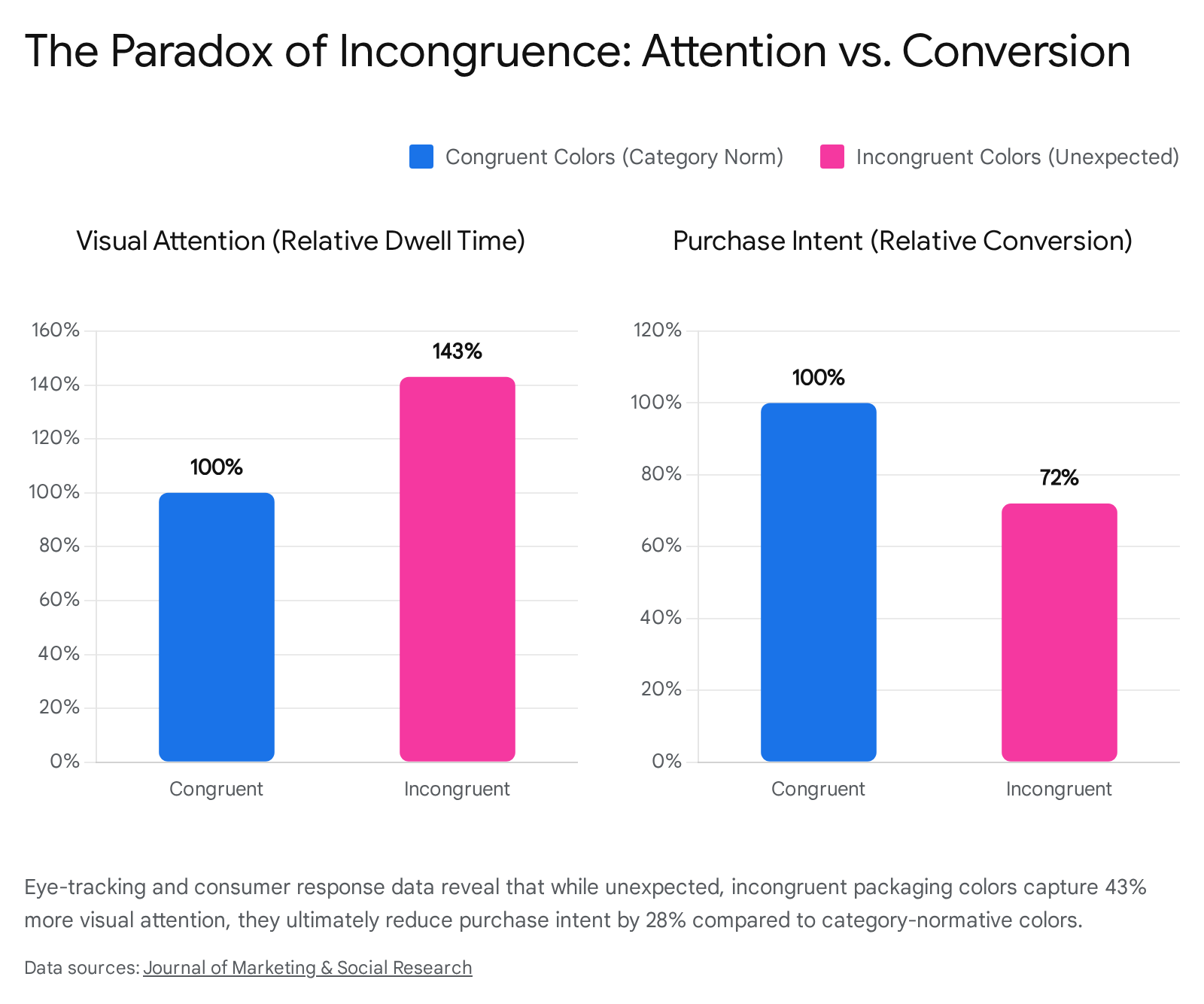
However, this heightened attention does not translate to commercial success. The same studies reveal that despite capturing visual focus, incongruent colors result in 28% lower purchase intention scores 4. Consumers undoubtedly notice the incongruent product, but the cognitive dissonance prevents them from trusting its efficacy or safety enough to purchase it. Therefore, deviating from category color norms must be a highly calculated, strategic decision, typically reserved only for disruptive brands attempting to signal radical, category-defining innovation rather than routine product differentiation 4.
Deconstruction of the 80 Percent Brand Recognition Statistic
Within modern marketing literature and design strategy, a compelling and ubiquitous statistic frequently emerges: "Color increases brand recognition by 80%" 12034. This figure has achieved legendary status in the industry and is frequently utilized by agencies to justify strict color accuracy tolerances (delta E values) in print production and digital branding campaigns. However, recent rigorous re-evaluations of the origin of this claim - traced back to foundational research conducted by Dr. Ellen Hoadley at Loyola University Maryland in 1990 - reveal that the statistic has been broadly misinterpreted and detached from its original context 2728.
The original Loyola research did not test the difference between highly specific brand hues (e.g., comparing consumer recognition of "Coca-Cola Red" versus "Target Red") or the impact of minor saturation deviations in packaging. Instead, the study measured the fundamental difference in human information processing and memory retention between monochrome (black and white) documents and documents utilizing any color 202728. In the early 1990s, when color printing and displays were rare and expensive, the addition of color enhanced document processing and recognition by up to 80% compared to simple grayscale text 2728.
While the 80% figure is technically accurate regarding the general cognitive advantage of chromatic over achromatic stimuli, using it to demand microscopic color accuracy is a misapplication of the data 20. Nevertheless, the underlying principle that color is a foundational mnemonic device remains entirely valid. Consumers file brands in their mental catalogs primarily by visual markers; research suggests that 81% of people remember a brand's color, while only 43% remember its actual name 5. Therefore, while minute technical deviations in a printed hue may not drastically alter consumer recognition, overarching color consistency across all consumer touchpoints is paramount for maintaining brand identity. Unplanned or erratic changes to established brand colors disrupt the psychological contract with the consumer, with Adobe research indicating that 18% of consumers report feeling emotionally disconnected and 12% actively abandon a brand following a major color shift 29.
Cross-Cultural Variations in Color Perception
While evolutionary biology dictates certain universal physiological responses to color, cultural orientation significantly moderates the referential meaning and emotional resonance of those colors 81330. A brand color that signals purity or prestige in one geographic market may signal death or vulgarity in another. Consequently, global marketing strategies cannot rely on monolithic color palettes; they must integrate localized color psychology to avoid catastrophic misinterpretations.
Western and East Asian Paradigms
The most profound differences in color psychology exist between Western cultures (North America and Europe) and East Asian cultures. In the West, red is heavily associated with passion, love, excitement, urgency, and danger 40414243. In stark contrast, Chinese and other East Asian cultures view red as the ultimate symbol of good fortune, prosperity, long life, and celebration. It is the dominant color for weddings, the Lunar New Year, and traditional gifts of money 16404344. Consequently, global brands like Coca-Cola successfully leverage their red branding in China to align seamlessly with local cultural celebrations 44. Furthermore, financial markets in East Asia use red to denote stock market gains and prosperity, whereas Western markets use green for gains and red to indicate losses 43.
White presents another critical dichotomy. Western societies associate white with purity, cleanliness, peace, and marriage, making it ideal for healthcare, bridal, and minimalist tech branding 404144. In many East Asian cultures, however, white is the traditional color of death, mourning, and funerals 16404244. Applying Western minimalist white packaging to certain product categories in Asian markets without adaptation can inadvertently evoke strong associations with misfortune, sorrow, or sterility 41.
Middle Eastern, Indian, and African Contexts
The Middle East features distinct color associations heavily influenced by the regional environment and the Islamic faith. Green is profoundly significant, symbolizing paradise, divine light, and religious devotion 164431. Brands operating in the Middle East have adapted their regional advertising to feature green prominently, signaling cultural sensitivity, respect for traditions like Ramadan, and sustainability 44. Yellow in the Middle East is associated with the desert, nature, and wealth, though in Egypt specifically, it is linked to mourning due to deep historical connections with gold mummification masks 4041. Orange, which typically represents warmth and autumn harvest in the West, is associated with loss and mourning in several Middle Eastern demographics 40.
In Indian culture, color is deeply tied to religious symbolism. Red is the color of purity, fertility, and is traditionally worn by brides, though in specific Southern Indian regions, it can stand for violence and disruption 404243. Orange (specifically saffron) represents the sacral chakra, courage, and sacrifice, holding immense sacred value in Hinduism 4042.
In African cultures, color symbolism is frequently tied to societal hierarchy, wealth, power, and spirituality 16. White is generally associated with purity, spiritual cleansing, and festive occasions, though in Ethiopia, it specifically indicates illness 41. Red is often treated with strict caution; in some sub-Saharan regions, it is considered holy and reserved for specific rituals, while in other areas, it is strictly the color of mourning, death, or bloodshed 414344. Yellow is highly regarded in many African nations, traditionally worn only by those of high social rank due to its association with spiritual purity, fertility, the precious nature of life, and material wealth 4041.
| Color | Western Cultures | East Asian Cultures | Middle Eastern Cultures | African & Indian Cultures |
|---|---|---|---|---|
| Red | Passion, excitement, love, danger, urgency. | Luck, prosperity, celebration, stock market gains. | Danger, caution, bravery, war. | Africa: Mourning, death, bloodshed, or holiness. India: Purity, bridal wear. |
| White | Purity, peace, cleanliness, weddings. | Death, mourning, misfortune, humility. | Purity, peace, equality. | Africa: Cleansing, good luck (illness in Ethiopia). India: Mourning, peace. |
| Yellow | Happiness, optimism, warmth, caution. | Courage, prosperity, sacredness. (Vulgarity in certain Chinese contexts). | Wealth, desert (mourning in Egypt). | Africa: High status, spiritual purity, fertility. India: Sanctity, commerce. |
| Green | Nature, eco-friendliness, health, inexperience. | Health, new beginnings, eternity. | Islam, paradise, divine light, religious devotion. | Africa: Restoration, growth. India: Islam representation, new beginnings. |
| Blue | Trust, security, corporate authority, masculinity. | Healing, immortality, relaxation, betterment of self. | Safety, protection, spirituality. | Africa: Harmony, love. India: Strength, Krishna symbolism. |
Color Strategy in Sustainable Packaging
As environmental consciousness increasingly dictates macroeconomic consumer behavior, the psychology of sustainable packaging has become a vital area of research for FMCG (Fast-Moving Consumer Goods) brands. Consumers, particularly younger demographics like Millennials and Generation Z, actively expect packaging to serve as tangible proof of a brand's authenticity regarding its environmental commitments 4632.
The Sustainability Halo Effect
When consumers encounter packaging that utilizes natural color palettes - predominantly earthy greens, soft browns, muted terracottas, and unbleached neutrals - it triggers a powerful psychological phenomenon known as the "halo effect" 4632. In this cognitive context, the positive environmental and ethical associations generated by the packaging's color are subconsciously extended to the corporate brand and the physical product inside. Consumers automatically assume that a product housed in eco-friendly colored packaging is healthier, of higher natural quality, and produced by a more ethical, transparent company 224632. Quantitative market research indicates that utilizing eco-friendly packaging featuring unbleached brown or earthy green hues can increase baseline customer trust metrics by up to 45% 17. Furthermore, a recent empirical study found that low hue diversity combined with low saturation significantly enhances a consumer's perception of a product's "naturalness" 20.
Material Congruence and Greenwashing Avoidance
However, the psychological impact of color in sustainable packaging is inextricably linked to the physical materials used. To avoid severe consumer backlash and accusations of "greenwashing" - where a brand deceptively uses green colors to feign environmental responsibility without implementing actual sustainable practices - the color must be entirely congruent with the tactile experience of the packaging 46.
If a brand prints a bright, nature-inspired green onto a high-gloss, non-recyclable, single-use plastic wrapper, consumers experience cognitive dissonance and quickly disengage, recognizing the visual manipulation 46. Conversely, minimalist layouts utilizing low-saturation, uncoated, or unbleached tactile materials (such as kraft paper, molded pulp, or compostable mailers printed with soy-based inks) feel inherently more authentic and premium than flashy designs 4632. While bright green is an effective cue for signaling sustainability, it must be paired with clear recycling iconography and genuinely eco-friendly substrate materials to foster authentic emotional connections and justify premium ecological pricing 2232.
Digital Branding and E-Commerce Environments
The translation of color psychology from physical packaging on a retail shelf to digital environments requires adapting to entirely different user behaviors, significantly shorter attention spans, and the backlit constraints of screen-based interaction 23334.
Interface Hierarchies and Conversion Rates
In e-commerce and digital user interfaces (UI), color operates as the primary architectural tool for establishing visual hierarchy and guiding the user's eye toward specific conversion points. High-contrast colors are critical for Call-To-Action (CTA) buttons, navigation cues, and promotional banners. Heat mapping tools and eye-tracking studies reveal that high-contrast colored elements receive 23% more clicks than their low-contrast counterparts 1.
A well-documented A/B testing study demonstrated that red CTAs outperformed green CTAs by 21% in general digital contexts due to the inherent urgency, visibility, and physiological arousal that red commands 1. However, demonstrating the paramount importance of contextual meaning, the same study found that green CTAs performed significantly better when the interface was selling eco-friendly products, as the color seamlessly aligned with user expectations for the specific category 1.
Digital designers strategically leverage warm colors (red, orange, coral) to drive urgency, highlight scarcity, and encourage impulse purchases in e-commerce interfaces. Conversely, cool colors (blue, gray, muted teal) are utilized to reduce cognitive friction, build trust during the sensitive payment and checkout process, and ultimately lower shopping cart abandonment rates 2224. A 2026 study in the Journal of Consumer Psychology also highlighted the intersection of digital color and personality traits, demonstrating that when interface colors matched user personality types (e.g., blue interfaces for introverted users, red for extroverted users), the system was evaluated as significantly more likeable and credible, leading to higher sustained usage intention 33.
Predictive Color Trends and Festive Congruence
Consumer digital fatigue, screen exhaustion, and the overstimulation of modern web environments have driven a notable shift in digital color trends for 2025 and 2026. Academic and industry research highlights several emerging visual movements aimed at psychological soothing:
- Digital Neutrals: Soft grays, muted beiges, and sleek off-whites are dominating web and UI design. These low-saturation colors provide visual balance, digital calm, and clarity, allowing product images to stand out without forcing the interface to compete for the user's attention 2.
- Hyper-Natural Greens: Algae, moss, fern, and sage tones are surging in digital branding to visually communicate wellness, ecological intent, and organic authenticity in an increasingly artificial digital landscape 2.
- Soft Tech Blues and Purples: Fintech startups, healthcare providers, and app developers are migrating away from harsh, saturated primary blues toward muted lavender, slate blue, periwinkle, and Pantone's "Solace Blue." These colors communicate stability, security, and digital elegance while significantly minimizing eye strain 2.
- Cultural Fusion Palettes: Lifestyle brands are increasingly adopting inclusive palettes featuring turmeric yellow, deep burgundy, and rich indigo. These warm, spice-inspired tones reflect a renewed consumer interest in global connection, heritage, and emotional resilience 2.
Furthermore, recent research in the International Journal of Electronic Commerce Studies on social media advertising indicates that "festive color congruence" acts as a powerful catalyst for consumer behavior. When the background colors of digital advertisements mathematically match the thematic expectations of a specific cultural event or holiday season, it significantly enhances the perceived quality of the product. This congruence bypasses strict deliberative evaluation and directly triggers impulsive buying behavior through heightened positive emotional responses 34.
Conclusion
The influence of color psychology on consumer perception, brand equity, and purchase intent is profound, pervasive, and highly systematized. The empirical evidence demonstrates that color is not governed by a universal set of simplistic, immutable rules, but rather by a complex, dynamic interplay of evolutionary biology, associative learning, category norms, and cultural frameworks.
The analysis indicates that while high color saturation and warm hues are highly effective strategic tools for capturing immediate visual attention, signaling product potency, and driving impulse purchases for hedonic goods, low saturation, cool hues, and dark values are vastly superior for establishing corporate trust, communicating luxury continuity heritage, and justifying premium pricing for utilitarian products. Furthermore, the effectiveness of any color strategy is entirely contingent upon its congruence with the brand's stated personality and the physical or digital context in which it is presented. As global markets interconnect and modern consumers demand greater authenticity - particularly regarding environmental sustainability and digital well-being - marketers and designers must apply color deliberately. Ensuring visual identities are both culturally resonant and contextually appropriate is no longer merely an aesthetic choice, but a fundamental requirement to optimize brand equity and drive consumer engagement in a crowded visual economy.