
How to Read Candlestick Charts for Beginners
A candlestick chart visually represents the open, high, low, and closing prices of an asset over a specific time period. By reading the size, shape, and color of the candle's body and wicks, beginners can quickly interpret market momentum and the psychological battle between buyers and sellers. While these charts highlight potential trend reversals, they are most effective when evaluated alongside trading volume and broader market context.
When new investors first open a trading platform to analyze a stock, cryptocurrency, or foreign exchange pair, the default view is almost always a candlestick chart. To the untrained eye, the screen looks like a chaotic scatter of red and green blocks with varying lines poking out of them. However, a stock chart is not a crystal ball; it is a visual ledger of human behavior 1. Every candlestick is a recorded transaction - a compromise between a buyer's fear of missing out and a seller's fear of losing money. Learning to read candlestick charts is about learning to interpret the collective psychology of the market. This comprehensive guide explores the rich history of candlestick charting, the anatomy of individual candles, the most critical price action patterns, the empirical science behind their reliability, and the common mistakes beginners must avoid.
The Origins: From Japanese Rice Markets to Global Finance
Modern cryptocurrency and stock traders pull up candlestick charts so reflexively that they often forget the digital bars in front of them are centuries old. The visualization, the patterns, and the behavioral psychology underpinning them originated on the rice trading floors of 18th-century Osaka, Japan 2.
In the 1700s, Japan established the Dojima Rice Exchange, an institution that issued "rice coupons" functioning essentially as the world's first organized futures contracts 23. A wealthy rice merchant named Munehisa Homma, operating out of the town of Sakata, realized that while the fundamental supply and demand of physical rice dictated its baseline value, the day-to-day market price was heavily influenced by the emotions of the traders 245. Homma began meticulously tracking the daily opening, highest, lowest, and closing prices of rice contracts. He understood that mapping this data allowed him to read at a glance who was winning the day's psychological battle between fear and greed 24.
His codified method of tracking these repeating psychological cycles became known as the "Sakata Method" 234. Homma's approach was so extraordinarily successful that he is rumored to have amassed the equivalent of billions of dollars in today's money and was elevated to honorary Samurai status, earning him the moniker "The God of Markets" 412. His writings, particularly The Fountain of Gold, formed the absolute foundation of what Western traders now call Japanese candlestick charting 2.
Despite its immense profitability and centuries of use in Japan, candlestick charting remained virtually unknown in Western financial markets until the late 20th century. In 1989 and 1991, Steve Nison, a technical analyst, published papers and the seminal book Japanese Candlestick Charting Techniques, introducing Homma's centuries-old methodology to Wall Street 23412. Since then, the technique has become the global standard for charting across all asset classes, from traditional equities and commodities to decentralized digital assets 22.
Candlestick Charts vs. Line and Bar Charts
To understand why candlesticks are the preferred tool for active traders and analysts, it is helpful to compare them to other common charting methods. Financial charts exist to compress a stream of market activity into a digestible visual object, but different charts prioritize different data 8.
The Line Chart
A line chart is the simplest form of financial visualization. It connects a series of single price points - usually the closing price of each period - with a continuous line 9311. Line charts are excellent for taking a diagnostic X-ray of the big-picture, long-term trend 12. They remove intra-period noise and visual clutter, making it easy to spot overall trajectory and historic support or resistance zones 1213.
However, simplicity hides crucial details. A line chart is like reading only the final sentence of every chapter in a book; the reader knows how things ended, but misses the entire plot 9. Because it discards the opening, high, and low prices, the line chart glosses over the volatility, the dramatic price swings, and the shifts in momentum that occur during the trading day 11. If a stock crashes 15% in the morning but rallies to close flat by the afternoon, a daily line chart will show a completely flat line, erasing the massive panic and subsequent buying frenzy that occurred.
The Bar Chart (OHLC)
A bar chart, also known as an OHLC chart (Open, High, Low, Close), plots the same four data points as a candlestick chart but uses a distinctly different visual grammar 911144. Each period is represented by a single vertical line indicating the high-low range. A small horizontal tick on the left side of the vertical line marks the opening price, and a small horizontal tick on the right side marks the closing price 194.
While bar charts provide comprehensive data and are favored by some traditionalists and algorithmic traders for their austere structure, they are visually demanding 91213. Traders must actively focus to see where the open and close sit relative to the high and low, making it difficult to instantly assess market sentiment. Bar charts demand more imagination from the analyst to understand the relationship between consecutive periods 12.
The Advantage of the Candlestick Chart
Candlestick charts use the exact same OHLC data as bar charts but encode it into a highly intuitive format using thick, color-coded bodies 2916. The body immediately draws the eye, allowing traders to absorb the market's narrative instantly 9. A quick glance at a candlestick chart reveals a detailed story of buying and selling pressure that would take significantly more effort to extract from a bar chart.
| Charting Method | Data Points Tracked per Period | Primary Visual Element | Core Advantage for Investors | Core Disadvantage for Investors |
|---|---|---|---|---|
| Line Chart | 1 (Closing Price) | Continuous connected line. | Cleanest view of macro trends; easy for beginners to read. | Hides all intraday volatility and price extremes. |
| Bar (OHLC) Chart | 4 (Open, High, Low, Close) | Vertical line with left/right horizontal ticks. | Comprehensive data without the visual bias of filled colors. | Difficult to quickly assess bullish or bearish momentum. |
| Candlestick Chart | 4 (Open, High, Low, Close) | Rectangular colored body with vertical wicks. | Immediate visual recognition of sentiment, control, and momentum. | Can appear cluttered on micro-timeframes with high volatility. |
The Anatomy of a Single Candlestick
To read a candlestick chart effectively, one must first master the visual grammar of a single candle. A candlestick is a compressed summary of all the trading activity that occurred within a specific time bucket 8. If the analyst is looking at a "daily" chart, each candle represents one trading day. If looking at a "1-hour" chart, each candle represents exactly 60 minutes of trading 95.
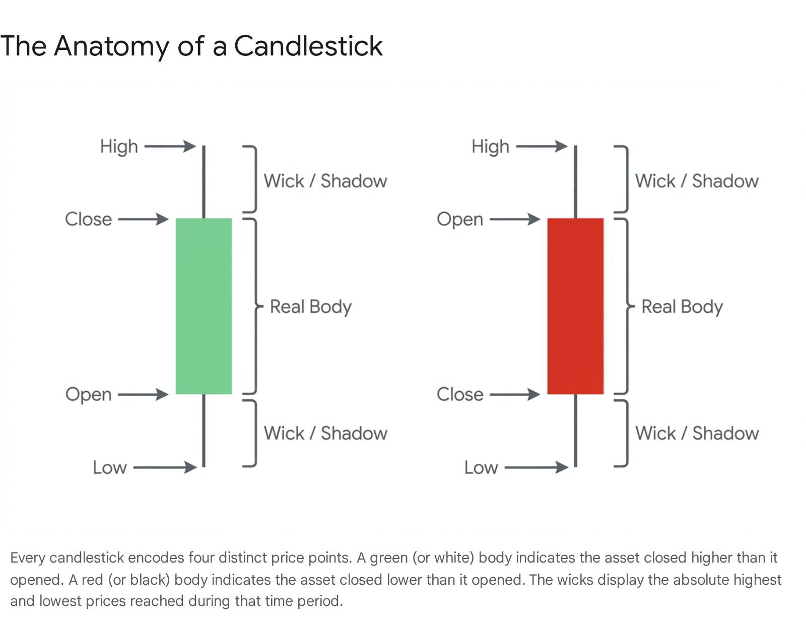
Every candlestick is constructed using four anchor prices, collectively known by the acronym OHLC 91418: * Open: The price of the very first trade recorded when the designated time period begins 8914. * High: The absolute highest price reached by the asset at any point during that time period 91418. * Low: The absolute lowest price reached by the asset at any point during that time period 91418. * Close: The price of the final trade recorded when the designated time period ends 8914.
These four numbers are translated into two primary visual components: the Real Body and the Wicks (also known in technical literature as shadows or tails) 86.
The Real Body and Color Coding
The most prominent part of the candlestick is the thick, rectangular section called the real body 9320. The body visually spans the vertical distance between the opening price and the closing price 89. It deliberately ignores the erratic path the price took during the session and focuses entirely on the net movement from start to finish 8.
To immediately communicate the direction of that net movement, the body is color-coded: * Bullish Candles (Green or White): If the closing price is higher than the opening price, the asset gained value over the period. The candle is colored green (or left hollow/white in traditional black-and-white print charts) 3421. The bottom edge of the body marks the open, and the top edge marks the close 2022. * Bearish Candles (Red or Black): If the closing price is lower than the opening price, the asset lost value. The candle is colored red (or filled solid black) 3421. The top edge of the body marks the open, and the bottom edge marks the close 2022.
The size of the real body is a direct indicator of momentum and conviction. A long body indicates strong, decisive directional movement; the buyers or sellers were fully in control and pushed the price significantly away from its starting point 11421. A short body indicates consolidation, low volatility, or a lack of conviction, demonstrating that the period opened and closed at roughly the same price 8421.
The Wicks (Shadows)
Extending vertically from the top and bottom of the real body are thin lines called wicks, or shadows 8420. These lines represent the extreme high and low prices reached during the time frame that fell outside the open-to-close range 920.
The wicks tell the critical story of what happened during the session that the closing price attempts to hide. They represent price exploration, battle lines, and ultimate rejection 823. * The Upper Wick: Extends from the top of the real body to the highest price of the session 921. A long upper wick indicates that buyers managed to push the price up significantly during the period, but sellers eventually overpowered them, forcing the price back down before the period closed 820. * The Lower Wick: Extends from the bottom of the real body to the lowest price of the session 921. A long lower wick indicates that sellers drove the price down aggressively, but buyers stepped in, absorbed the heavy selling pressure, and pushed the price back up toward the open 820.
The Psychology of Price Action: Buyers vs. Sellers
To read a candlestick chart effectively, an analyst must stop looking at the graphics as abstract geometric shapes and start viewing them as a relentless tug-of-war between two opposing forces: buyers (bulls) and sellers (bears) 5212324.
When buyers are aggressive, they are willing to pay higher and higher prices to acquire the asset, which drives the price up. When sellers are panicked or eager to take profits, they are willing to accept lower prices to offload the asset, driving the price down. Every candlestick freezes a specific moment of this ongoing psychological battle so analysts can determine who is winning 2324.
Consider a few pure psychological examples of how this conflict visualizes on a chart:
- Total Buyer Control (The Bullish Marubozu): A long green candle with virtually no wicks at the top or bottom 2024. This means that from the exact second the period opened to the exact second it closed, buyers were aggressively accumulating the asset. They never let the price drop below the open, and they closed it at the absolute high of the session. It is a sign of pure, uninterrupted bullish momentum 2024.
- Failing Buyer Momentum: A small green body with a massive upper wick 24. This tells a story of a failed offensive. The buyers surged forward, driving the price up to new highs, but they ran out of capital and momentum. Sellers capitalized on the inflated prices, dumped their supply, and drove the price all the way back down near the open. Even though the candle officially closed green, the psychology of the session is heavily bearish 24.
- Total Indecision (The Doji): A candle where the open and close are exactly the same (or within pennies of each other), resulting in a horizontal line for a body, with wicks extending above and below 202125. The bulls pulled the price up, the bears dragged it down, but when the clock ran out, they were back exactly where they started. The Doji represents a perfect equilibrium of supply and demand, often signaling that a prevailing trend is exhausting itself 21257.
Essential Candlestick Patterns for Beginners
Over the centuries, chartists have categorized specific sequences of candlesticks that repeatedly occur in financial markets. These "patterns" are essentially recurring psychological footprints that suggest a higher probability of a specific future outcome 52728.
Patterns are generally divided into reversal patterns (indicating an existing trend is about to change direction) and continuation patterns (indicating a brief pause before the current trend resumes). For beginners, identifying major reversal patterns is the most practical starting point, as these formations help identify crucial turning points in market structure 29.
Single-Candle Reversal Formations
Single-candle patterns require only one time period to form and often signal an immediate, violent rejection of a specific price level.
The Hammer is one of the most famous bullish reversal patterns. It appears exclusively at the bottom of a downtrend and looks exactly like its namesake: a small real body (which can be green or red) sitting at the top of the trading range, with a long lower wick that is at least twice the length of the body, and little to no upper wick 52130. The story behind the Hammer is one of fierce rejection. Sellers aggressively drove the price to new lows during the session, seemingly continuing the downtrend. However, those lower prices attracted massive institutional buying interest. Buyers completely overwhelmed the sellers, absorbing all the supply and driving the price back up to close near the open 30.
The exact inverse of the Hammer is the Shooting Star, a bearish reversal pattern that appears at the top of an uptrend. It features a small real body at the bottom of the range and a long upper wick 531. Buyers attempted to push the price to new highs, but the move was entirely unsustainable. Sellers stepped in heavily, forcing the price back down to the bottom of the session, signaling that bullish momentum is exhausted 524.
Another critical single-candle formation is the Spinning Top, characterized by a small real body perfectly centered between long upper and lower wicks 521. This pattern screams indecision. Neither buyers nor sellers could gain any real ground, hinting that the market might be about to turn or pause 21.
Two-Candle Reversal Formations
These patterns tell a story that plays out over two periods, often showing a complete and sudden shift in control from one side of the market to the other.
The Bullish Engulfing pattern forms at the bottom of a downtrend. It consists of a small red (bearish) candle followed immediately by a large green (bullish) candle whose real body completely covers, or "engulfs," the real body of the previous red candle 213233. The first candle shows the bears are still in control but losing momentum. The second candle opens lower, but buyers suddenly surge into the market, driving the price up so forcefully that it erases all the losses of the previous period and closes higher 2131. It is a definitive statement of a transfer of power to the bulls 32.
The opposite formation is the Bearish Engulfing pattern, occurring at the top of an uptrend. A small green candle is followed by a massive red candle that swallows it entirely 313334. The bulls were pushing the price up weakly, but in the next session, sellers dumped their assets en masse, overpowering the buyers and driving the price down significantly below the previous open. The bears have violently seized control 3334.
Another important two-candle dynamic is the Harami (the Japanese word for pregnant). A Harami occurs when a large candle is followed by a much smaller candle whose real body fits entirely within the vertical range of the prior candle's body 228. A bullish Harami occurs in a downtrend when a large red candle is followed by a small green candle, suggesting the selling pressure has suddenly contracted 22.
Three-Candle Reversal Formations
These patterns take three full periods to develop and are often considered highly reliable because they inherently contain a built-in period of confirmation 36.
The Morning Star is a bullish reversal appearing at the bottom of a downtrend. This three-candle formation consists of a large red candle, a small-bodied candle (or Doji) that "gaps" lower, and finally a large green candle that closes well into the body of the first red candle 536. The narrative is clear: the first candle represents capitulation and panic selling. The second small candle shows that selling pressure has dried up, resulting in a standoff between buyers and sellers. The third massive green candle proves the buyers have won the standoff and are initiating a new uptrend 36.
Conversely, the Evening Star is a bearish reversal found at the top of an uptrend. This sequence features a large green candle, a small "star" candle indicating hesitation, and a large red candle driving the price back down 536. Euphoric buying is met with resistance, followed by a wave of heavy selling as traders rush to take profits, sparking a broader sell-off 36.
Do Candlestick Patterns Actually Work? The Science
When beginners first read about candlestick patterns, the explanations often sound so flawlessly logical that it is tempting to view them as cheat codes for the market. It is easy to assume that every time a Hammer appears, the stock will go up. However, the reality of financial markets is vastly more complex, and academic research provides a sobering reality check.
Do candlestick patterns actually possess predictive, statistical reliability, or are they just financial folklore? Extensive peer-reviewed research and quantitative backtesting conducted between 2024 and 2026 reveal that candlestick patterns do hold statistical significance, but they are absolutely not the standalone magic bullets that some educational materials suggest 273738.
The Myth of Standalone Reliability
In modern, highly liquid, algorithm-driven markets, a candlestick pattern traded completely in isolation is rarely a profitable system 2739.
To quantify this, researchers have conducted rigorous backtests. A comprehensive 2025 study analyzing historical price data from the Vanguard Real Estate ETF (VNQ) between 2008 and 2024 evaluated four classic patterns to test their reliability. The study found that the Hammer pattern had an accuracy rate of 59.86%, followed by the Bullish Engulfing pattern at 54.35% 4041. The bearish patterns performed worse, with the Bearish Engulfing succeeding only 42.39% of the time and the Hanging Man at 41.56% 4041.
Another extensive backtest spanning 2019 to 2024 on the Indian NIFTY 50 index showed a slightly more robust outcome for the Hammer pattern, identifying a 65.2% overall success rate as a short-term bullish reversal signal 30.
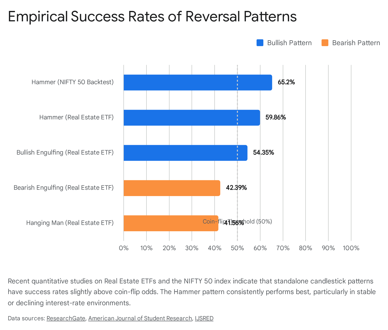
To summarize recent academic findings on the standalone predictive power of candlestick patterns:
| Candlestick Pattern | Market Index Studied | Test Period | Empirical Success Rate | Implication |
|---|---|---|---|---|
| Hammer (Bullish) | NIFTY 50 Index | 2019 - 2024 | 65.2% | Statistically significant edge over random chance 30. |
| Hammer (Bullish) | Vanguard Real Estate ETF | 2008 - 2024 | 59.86% | Most reliable pattern, particularly in declining rate environments 4041. |
| Bullish Engulfing | Vanguard Real Estate ETF | 2008 - 2024 | 54.35% | Marginal edge; requires confirmation tools 4041. |
| Bearish Engulfing | Vanguard Real Estate ETF | 2008 - 2024 | 42.39% | Highly unreliable in real estate markets without trend context 4041. |
| Hanging Man (Bearish) | Vanguard Real Estate ETF | 2008 - 2024 | 41.56% | Frequently yields false positives 4041. |
While a 60% to 65% success rate represents a statistically significant edge over a 50/50 coin flip, it also means that a trader relying solely on that pattern will be completely wrong almost 4 times out of 10. Quantitative researchers have concluded that when tested across vast datasets without any other filters, many candlestick patterns fail to consistently beat random chance after accounting for transaction costs and spread 279.
The Impact of Market Regimes and Volatility
The reliability of candlestick patterns changes drastically depending on the broader macroeconomic environment. The core premise of a candlestick is that it reflects human psychology. However, in times of extreme volatility or global economic crises, heightened uncertainty amplifies cognitive biases and essentially breaks the informational content of technical signals 3738.
A 2026 study analyzing pattern confirmation rates between stable periods and crisis episodes found that patterns display moderate reliability in stable, trending markets but lose a substantial part of their signaling power during crises, when price discontinuities increase 3738. When panic or irrational exuberance dominates, the subtle shifts in buyer/seller equilibrium shown by a Doji or a Harami are easily overwhelmed by erratic, headline-driven price action 37.
Furthermore, macroeconomic factors severely influence pattern success. The 2025 Real Estate ETF study revealed that the Hammer pattern was highly effective during periods of declining interest rates (the 10-Year Treasury Yield), while the Bullish Engulfing pattern performed much better when rates were rising 4041. The academic consensus is clear: Candlestick patterns possess a scientifically proven edge, but their effectiveness is heavily dependent on the broader context in which they appear 31.
The Critical Role of Context: Timeframes, Volume, and Indicators
Because candlestick patterns are not standalone prediction machines, experienced analysts never read them in a vacuum. A Hammer on a chart means very little on its own; a Hammer occurring at a major historical support level while trading volume spikes means a great deal 2739. To extract value from candlesticks, they must be combined with multi-timeframe analysis, volume data, and technical indicators 1243.
Zooming Out with Multi-Timeframe Analysis
One of the most powerful ways to interpret a candlestick is to view it through multiple lenses. Candlestick charts can be set to any timeframe, from micro intervals like a 1-minute chart to macro intervals like a 1-month chart 95.
The timeframe defines the gravity and reliability of the signal. A bullish engulfing pattern on a 1-minute chart might represent a temporary 60-second burst of buying by a single algorithmic trading bot. It is noisy and largely insignificant 544. However, a bullish engulfing pattern on a weekly chart means that, for an entire week, buyers consistently overpowered sellers, overcoming immense capital resistance 5.
Institutional traders often use a "top-down" approach. They use a daily or weekly chart to identify the overall macro trend and locate major zones of support and resistance. Then, they zoom into a 4-hour or 1-hour candlestick chart to look for specific entry signals, like a Hammer or an Engulfing pattern, to time their trade precisely 1239. Internal research from VT Markets in 2025 indicated that traders who utilized multi-timeframe candlestick analysis reduced their losing trades by 58% compared to those operating on a single timeframe 39.
Confirming Conviction with Trading Volume
A candlestick shows the analyst how far the price moved, but trading volume shows how much capital was backing that move 14344. Volume is the ultimate lie detector in technical analysis.
If a massive green breakout candle forms on the chart, but the trading volume for that day was significantly lower than average, the move is highly suspect. It suggests that the price moved up easily only because there was a lack of sellers, not because there was a surge of aggressive institutional buyers 2843. Conversely, if a reversal pattern like an Engulfing candle occurs alongside a massive spike in trading volume - often two to three times the average - it signals that institutional money has stepped in with deep conviction to change the trend 283945.
Integration with Technical Indicators
To filter out false signals, professionals layer quantitative indicators over the qualitative psychological clues provided by candlesticks 13746.
- Moving Averages: Traders use tools like the 50-day or 200-day Moving Average (DMA) to define the long-term trend. If the price is above the 200 DMA, the macro trend is bullish. In this environment, an analyst would actively look for bullish candlestick patterns (like Hammers) to buy dips, while largely ignoring bearish candlestick patterns, which have lower probability against the primary trend 14647.
- Relative Strength Index (RSI): The RSI is a momentum oscillator that measures whether an asset is technically overbought (overvalued) or oversold (undervalued). A highly effective strategy involves waiting for the RSI to drop below 30, indicating an asset is extremely oversold, and then looking for a bullish candlestick reversal pattern to confirm that the selling pressure has finally exhausted itself 374448.
- MACD (Moving Average Convergence Divergence): Used to identify changes in the strength and direction of a trend. A positive MACD crossover occurring simultaneously with a bullish candlestick formation provides a highly reliable, mathematically supported entry signal 374449.
Common Mistakes Beginners Must Avoid
Misinterpreting candlestick charts is a rite of passage for new traders. However, recognizing and actively avoiding widespread psychological and analytical traps can vastly accelerate the learning curve 435051.
1. Trading Without Support and Resistance Context The single most frequent mistake is identifying a pattern and immediately executing a trade without checking the broader market structure 435051. A Hammer appearing randomly in the middle of a choppy, sideways market carries virtually no predictive weight. Reversal patterns are only meaningful when there is an established trend to reverse, and they are most potent when they occur exactly at a historical line of support or resistance 505152.
2. Over-Reliance on Micro-Timeframes Beginners are often drawn to the fast-paced action of 1-minute or 5-minute candlestick charts. However, lower timeframes are heavily plagued by market noise, algorithmic spoofing, and erratic volatility. The statistical reliability of patterns plummets on these micro-timeframes 1239. 2025 research indicates pattern success rates decline up to 43% during extreme intraday indecision periods 39. Staring at 1-minute charts often leads to overtrading, emotional decision-making, and rapid capital depletion 4344.
3. Failing to Wait for Confirmation A candlestick is not a fact until the designated time period officially closes 4450. During a trading session, a candle might look like a perfect Bullish Engulfing pattern, prompting an eager beginner to buy. However, in the final ten minutes of the session, a wave of selling might drive the price down, transforming the beautiful green body into a bearish Shooting Star with a massive upper wick. Trading on a candle before it closes is guessing, not analyzing 4450.
4. Pattern Blindness and Rigidity Assuming all candlestick patterns have the exact same significance, or rigidly treating textbook definitions as absolute laws, is a recipe for failure 3944. Real markets are exceptionally messy. A pattern might not look exactly like the idealized, perfectly proportioned drawings found in educational materials, but the underlying psychology - the rejection of a level or the shifting balance of power - might still be highly valid 3950. Traders must focus on the story the candle is telling, rather than demanding structural perfection.
Bottom line
Candlestick charts are the foundational visual language of the financial markets, encoding the opening, closing, high, and low prices into recognizable shapes that instantly reveal the balance of power between buyers and sellers. While mastering classic patterns like the Hammer or Bullish Engulfing provides valuable clues about impending trend reversals, rigorous peer-reviewed research proves these patterns are not foolproof predictors when used in isolation. To succeed, analysts must treat candlesticks as just one piece of a broader puzzle, consistently combining them with multi-timeframe trend analysis, volume confirmation, and strict quantitative indicators.